
MAHÓN
4 WEEKS
NOVEMBER 2024
UX/UI LEAD

LOST IN THE UKAY-VERSE
LOST IN THE UKAY-VERSE
The secondhand apparel market in Philippines is projected to register a higher CAGR. But While the ukay-ukay (local term for thrift shops) market is popular in the country, many consumers find the current buying and selling experience inconvenient and time-consuming. This fragmented market, lacking a centralized digital platform, limits accessibility and hinders growth.
The secondhand apparel market in Philippines is projected to register a higher CAGR. But While the ukay-ukay (local term for thrift shops) market is popular in the country, many consumers find the current buying and selling experience inconvenient and time-consuming. This fragmented market, lacking a centralized digital platform, limits accessibility and hinders growth.
THERE’S A STAIN!
THERE’S A STAIN!
Inconvenient and Time-Consuming: Current methods of buying and selling ukay-ukay, whether in physical stores or online, are often inconvenient and require significant time and effort.
Lack of Transparency: Buyers often lack sufficient information about item condition, sizing, and seller reputation, leading to uncertainty and potential dissatisfaction.
Missed Opportunities for Personalization: There are few opportunities for personalized recommendations, curated collections, or building a community around ukay-ukay fashion.
SIFTING THROUGH THE RACK
SIFTING THROUGH THE RACK
The design process for Mahon began with identifying the key pain points of ukay-ukay shoppers and sellers. Through user research and competitive analysis, I defined the core features and functionalities of the app. This led to the creation of user flows and wireframes, which were then translated into high-fidelity mockups showcasing the app's visual design and user interface.
The design process for Mahon began with identifying the key pain points of ukay-ukay shoppers and sellers. Through user research and competitive analysis, I defined the core features and functionalities of the app. This led to the creation of user flows and wireframes, which were then translated into high-fidelity mockups showcasing the app's visual design and user interface.
RESEARCH
RESEARCH
We got a significant first-mover advantage for Mahón, positioning it to capture a large untapped market!
We got a significant first-mover advantage for Mahón, positioning it to capture a large untapped market!
Although there are no direct competitors offering a comprehensive ukay-ukay app, there is indirect competition from general online marketplaces (e.g., Carousell, Facebook Marketplace) and social media groups. However, these platforms lack specialized features for ukay-ukay, such as detailed filtering by clothing type, size, and brand, as well as secure transaction options and a dedicated community for secondhand fashion enthusiasts. Mahon aims to address these shortcomings by providing a tailored experience for the ukay-ukay community.
Although there are no direct competitors offering a comprehensive ukay-ukay app, there is indirect competition from general online marketplaces (e.g., Carousell, Facebook Marketplace) and social media groups. However, these platforms lack specialized features for ukay-ukay, such as detailed filtering by clothing type, size, and brand, as well as secure transaction options and a dedicated community for secondhand fashion enthusiasts. Mahon aims to address these shortcomings by providing a tailored experience for the ukay-ukay community.


Target Thrift Shoppers
Target Thrift Shoppers
Target Thrift Shoppers
Considering the competitive analyses, I went with a more general approach towards the target users but still highly considering inclusivity. I asked 5 people of my local network, aged 18-60, located both in rural and urban areas, to do online user interviews and user surveys.
Considering the competitive analyses, I went with a more general approach towards the target users but still highly considering inclusivity. I asked 5 people of my local network, aged 18-60, located both in rural and urban areas, to do online user interviews and user surveys.
UKAY HAULING
UKAY HAULING
Before concluding on anything, I always make sure that I take time to pause and reflect with the users and dig deep with the real problem. Always putting myself in their shoes. I invested time and energy to explore online platforms and buyer-seller interaction to have a better grasp with the current state of the industry from a consumer’s POV.
Before concluding on anything, I always make sure that I take time to pause and reflect with the users and dig deep with the real problem. Always putting myself in their shoes. I invested time and energy to explore online platforms and buyer-seller interaction to have a better grasp with the current state of the industry from a consumer’s POV.
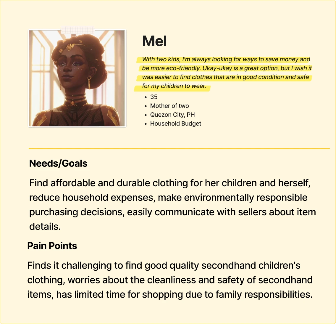
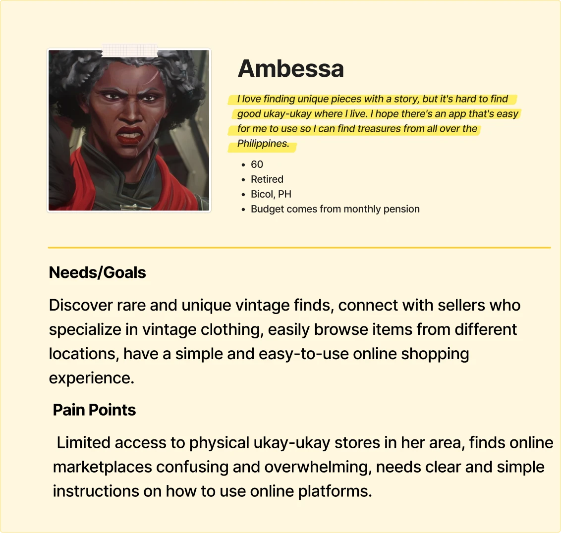
In addition, I made user personas.
In addition, I made user personas.


IDEATE
IDEATE
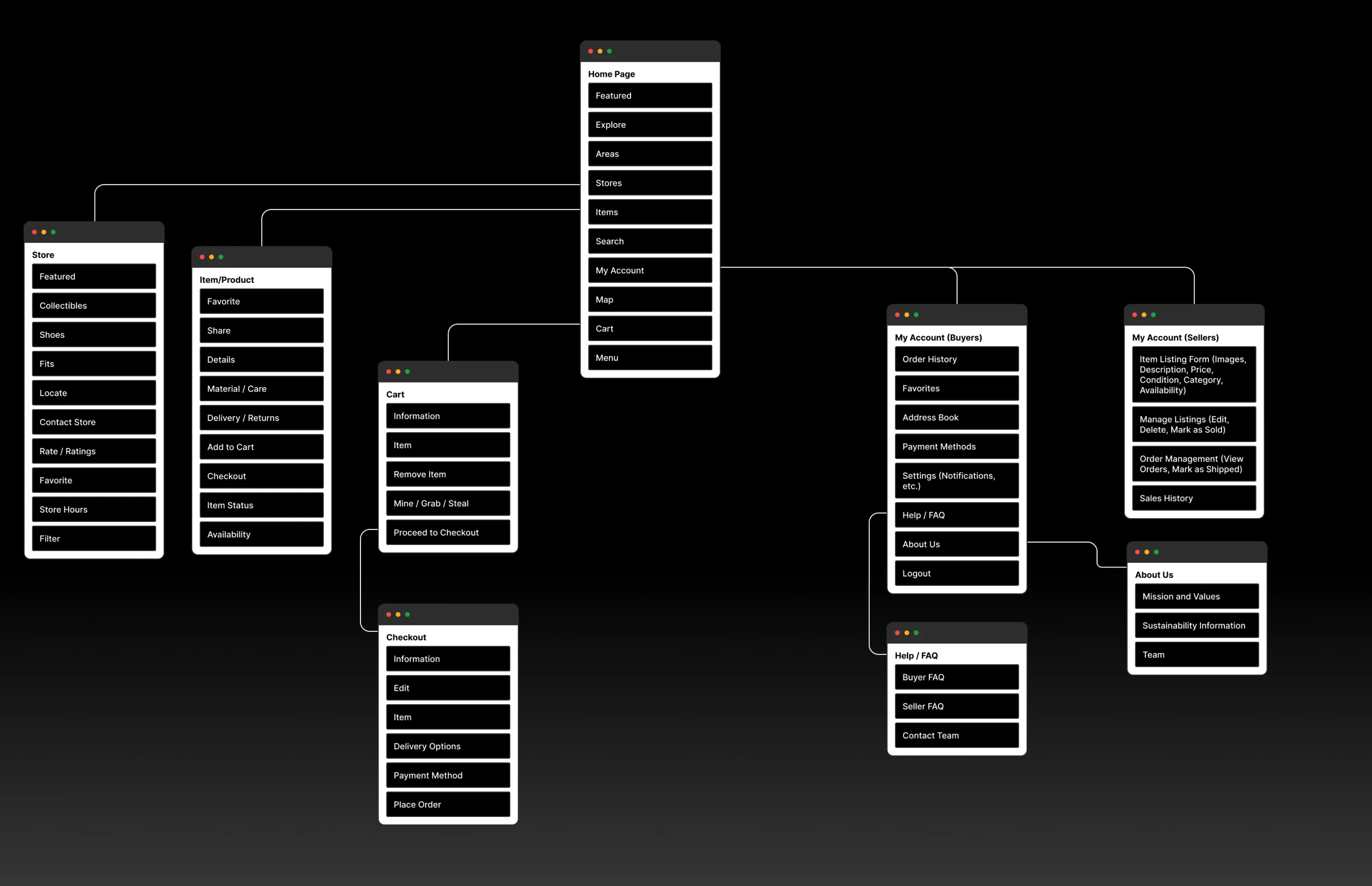
The sitemap for the app was handled with great care and consideration. I made sure that it prioritizes discoverability and ease of use, reflecting insights gathered from user research.
The sitemap for the app was handled with great care and consideration. I made sure that it prioritizes discoverability and ease of use, reflecting insights gathered from user research.
The sitemap for the app was handled with great care and consideration. I made sure that it prioritizes discoverability and ease of use, reflecting insights gathered from user research.
Key design decisions, such as the prominent search bar, robust filtering options within the "Shop/Browse" section, and dedicated seller profiles, directly address user pain points related to finding specific items and connecting with trusted sellers. The separation of buyer and seller functionalities further streamlines the user experience for each target audience.
Key design decisions, such as the prominent search bar, robust filtering options within the "Shop/Browse" section, and dedicated seller profiles, directly address user pain points related to finding specific items and connecting with trusted sellers. The separation of buyer and seller functionalities further streamlines the user experience for each target audience.
Key design decisions, such as the prominent search bar, robust filtering options within the "Shop/Browse" section, and dedicated seller profiles, directly address user pain points related to finding specific items and connecting with trusted sellers. The separation of buyer and seller functionalities further streamlines the user experience for each target audience.
DESIGN
DESIGN
Wireframes and Lo-Fi Prototypes
Wireframes and Lo-Fi Prototypes
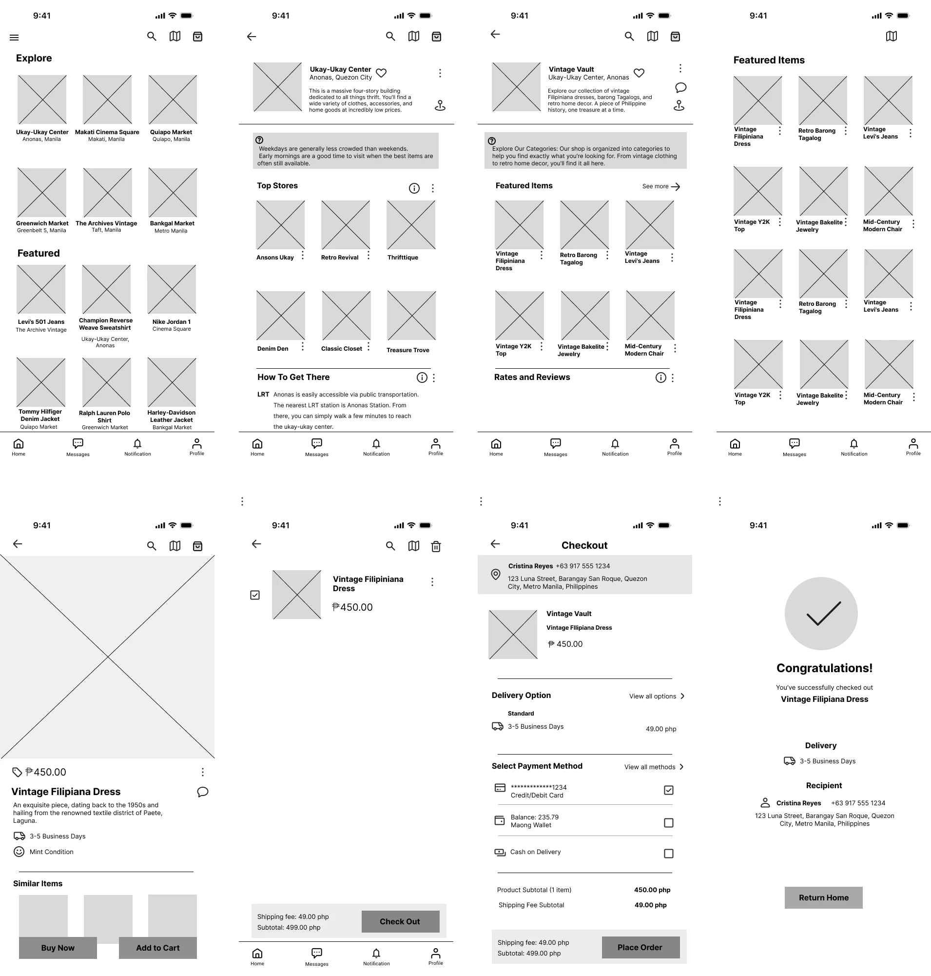
With the sitemap in hand, I proceeded to drawing the wireframes.
With the sitemap in hand, I proceeded to drawing the wireframes.
With the sitemap in hand, I proceeded to drawing the wireframes.
During this process, I thought of adding another feature which is the Community Forums and Discussion Boards. However, after thorough deliberation (with myself :P), I decided not to push through with this feature since it’s lacking usability testing and would require such. One possibility in mind is that it can create confusion in the app’s navigation for users who are less tech-savvy. But we will definitely save this later as this can create a sense of community among our users!
During this process, I thought of adding another feature which is the Community Forums and Discussion Boards. However, after thorough deliberation (with myself :P), I decided not to push through with this feature since it’s lacking usability testing and would require such. One possibility in mind is that it can create confusion in the app’s navigation for users who are less tech-savvy. But we will definitely save this later as this can create a sense of community among our users!
During this process, I thought of adding another feature which is the Community Forums and Discussion Boards. However, after thorough deliberation (with myself :P), I decided not to push through with this feature since it’s lacking usability testing and would require such. One possibility in mind is that it can create confusion in the app’s navigation for users who are less tech-savvy. But we will definitely save this later as this can create a sense of community among our users!

A EUREKA MOMENT!
A EUREKA MOMENT!
During the process of many UI iterations, I came up with a feature that is familiar among locals.
During the process of many UI iterations, I came up with a feature that is familiar among locals.
During the process of many UI iterations, I came up with a feature that is familiar among locals.
A little back story, one thing you’d notice when you stumble upon thrift listings on social media platforms like Facebook or Instagram is a term “MINE”, “GRAB”, or “STEAL.”
A little back story, one thing you’d notice when you stumble upon thrift listings on social media platforms like Facebook or Instagram is a term “MINE”, “GRAB”, or “STEAL.”
A little back story, one thing you’d notice when you stumble upon thrift listings on social media platforms like Facebook or Instagram is a term “MINE”, “GRAB”, or “STEAL.”
It is a way sellers set up a “bidding system” among their buyers. Buyers who comments “MINE” bids an item on the minimum price, those who comment “GRAB” bid a higher price, and the one who first comments “STEAL” instantly gets the item for the highest price that was set by the seller.
It is a way sellers set up a “bidding system” among their buyers. Buyers who comments “MINE” bids an item on the minimum price, those who comment “GRAB” bid a higher price, and the one who first comments “STEAL” instantly gets the item for the highest price that was set by the seller.
It is a way sellers set up a “bidding system” among their buyers. Buyers who comments “MINE” bids an item on the minimum price, those who comment “GRAB” bid a higher price, and the one who first comments “STEAL” instantly gets the item for the highest price that was set by the seller.

Photo from Facebook
Photo from Facebook
Photo from Facebook
MINE, GRAB, STEAL!
MINE, GRAB, STEAL!
With a new core feature in mind, thinking and deciding on how I can cooperate this with the user journey and interaction design was a big struggle. It’s something that is currently not yet on any platform or product so there was nothing to draw inspiration from. I was starting to think this just might be a big brain moment! :P
With a new core feature in mind, thinking and deciding on how I can cooperate this with the user journey and interaction design was a big struggle. It’s something that is currently not yet on any platform or product so there was nothing to draw inspiration from. I was starting to think this just might be a big brain moment! :P
With a new core feature in mind, thinking and deciding on how I can cooperate this with the user journey and interaction design was a big struggle. It’s something that is currently not yet on any platform or product so there was nothing to draw inspiration from. I was starting to think this just might be a big brain moment! :P
First Attempt
First Attempt


I tested adding a direction feature in the shop section to help less tech-savvy users navigate certain areas or shops.
I tested adding a direction feature in the shop section to help less tech-savvy users navigate certain areas or shops.
I also tested adding a feature where the system would let users know the last time a store restocked (3mos ago / Last week) as this was also a consideration for shoppers when deciding which store to navigate.
I also tested adding a feature where the system would let users know the last time a store restocked (3mos ago / Last week) as this was also a consideration for shoppers when deciding which store to navigate.
Last featured I thought of adding was a way to let users know how many users have already viewed the product. I ended up not adding this as it can be used to mislead users into thinking they must buy a product with urgency.
Last featured I thought of adding was a way to let users know how many users have already viewed the product. I ended up not adding this as it can be used to mislead users into thinking they must buy a product with urgency.


1st reason why I did not push with this design is because of how crowded it is. Too much text can confuse users where to look or navigate.
1st reason why I did not push with this design is because of how crowded it is. Too much text can confuse users where to look or navigate.
2nd reason is that it has too much colors. As much as the intention is to help users familiarize with the Mine/Grab/System, this will only overwhelm the less tech-savvy users.
2nd reason is that it has too much colors. As much as the intention is to help users familiarize with the Mine/Grab/System, this will only overwhelm the less tech-savvy users.
3rd and major reason is because frankly, it looks cheap and it looks nothing like the big boys in the current market.
3rd and major reason is because frankly, it looks cheap and it looks nothing like the big boys in the current market.
SHIFTING AWAY FROM “COLORS”
SHIFTING AWAY FROM “COLORS”

Drawing inspiration from current successful brands in the market and approaching a design from modernity and intuitiveness, I was able to come up with a product that is not just market ready but will also set a standard among potential competition.
Drawing inspiration from current successful brands in the market and approaching a design from modernity and intuitiveness, I was able to come up with a product that is not just market ready but will also set a standard among potential competition.
I changed it into Mahón (pronounced as ma-on) because of how it felt more unique. It is linked to the city of Mahón in Menorca, Spain where English ships would often stop to transship cargo destined for Spanish ports in the Levant (the eastern Mediterranean). This trade likely included the sturdy and denim cloths produced in or traded through Mahón.
I changed it into Mahón (pronounced as ma-on) because of how it felt more unique. It is linked to the city of Mahón in Menorca, Spain where English ships would often stop to transship cargo destined for Spanish ports in the Levant (the eastern Mediterranean). This trade likely included the sturdy and denim cloths produced in or traded through Mahón.
Initially, the app was called “Maong.” Maong is the Tagalog translation of “denim.” I decided to name it Maong because how much denim there is in an Ukay-Ukay store. You’d see it from jeans, jackets, etc. You would see multiple aisles filled with denim clothings.
Initially, the app was called “Maong.” Maong is the Tagalog translation of “denim.” I decided to name it Maong because how much denim there is in an Ukay-Ukay store. You’d see it from jeans, jackets, etc. You would see multiple aisles filled with denim clothings.
I changed it into Mahón (pronounced as ma-on) because of how it felt more unique. It is linked to the city of Mahón in Menorca, Spain where English ships would often stop to transship cargo destined for Spanish ports in the Levant (the eastern Mediterranean). This trade likely included the sturdy and denim cloths produced in or traded through Mahón.
BRANDING
BRANDING


Initially, the app was called “Maong.” Maong is the Tagalog translation of “denim.” I decided to name it Maong because how much denim there is in an Ukay-Ukay store. You’d see it from jeans, jackets, etc. You would see multiple aisles filled with denim clothings.
PROJECT TAKEAWAYS
PROJECT TAKEAWAYS
Designing this app took a lot reflecting and digging deep into my Filipino roots. I knew that if I was to initiate an app, it wouldn’t be a product that is already out there. It would be something that would help my people. It would be something that would solve real life problems.
Designing this app took a lot reflecting and digging deep into my Filipino roots. I knew that if I was to initiate an app, it wouldn’t be a product that is already out there. It would be something that would help my people. It would be something that would solve real life problems.
“You got to dig a little deeper, it really ain’t that far!” - Mama Odie, The Princess and the Frog
“You got to dig a little deeper, it really ain’t that far!” - Mama Odie, The Princess and the Frog
Validated the need for a dedicated ukay-ukay platform: User research clearly demonstrated the demand for a centralized and convenient way to buy and sell secondhand clothing in the Philippines, highlighting the limitations of current solutions.
Validated the need for a dedicated ukay-ukay platform: User research clearly demonstrated the demand for a centralized and convenient way to buy and sell secondhand clothing in the Philippines, highlighting the limitations of current solutions.
Emphasized the importance of trust and transparency: Addressing user concerns about item authenticity, condition, and secure transactions was crucial in building a trustworthy platform.
Emphasized the importance of trust and transparency: Addressing user concerns about item authenticity, condition, and secure transactions was crucial in building a trustworthy platform.
Reinforced the value of mobile-first design: Given the high mobile penetration in the Philippines, designing for mobile was essential for accessibility and usability.
Reinforced the value of mobile-first design: Given the high mobile penetration in the Philippines, designing for mobile was essential for accessibility and usability.