
SWIPING RIGHT FOR RESEARCH
Filipinos conducting academic research face significant challenges in participant recruitment due to the absence of dedicated, accessible, and ethical research platforms in the country. This deficiency forces researchers to rely on inefficient and often inappropriate methods, such as utilizing general social media platforms and even dating apps, leading to time wastage, compromised data quality, potential ethical breaches, and increased stress for researchers.
THE GREAT FILIPINO RESEARCH SCRAMBLE
Limited Research Infrastructure: Studies consistently point to challenges in research infrastructure, including funding, access to resources, and support systems for researchers. This lack of infrastructure extends to dedicated platforms for participant recruitment.
Social Media Reliance: Filipino students are highly active on social media. While this presents an opportunity for research dissemination, using general social media platforms for participant recruitment raises ethical concerns regarding privacy, informed consent, and data security.
Ethical Considerations: The Philippine government, through CHED and other relevant agencies, has guidelines on research ethics.
However, the lack of a dedicated platform makes it difficult to ensure adherence to these guidelines during the participant recruitment process, especially when using informal channels like social media.
Anecdotal Evidence and Observations: The very existence of widespread stories about students using social media and dating apps for research recruitment provides strong anecdotal evidence of the problem.
Emphasis on Collaboration: Current trends in research emphasize collaboration and interdisciplinary approaches. A dedicated platform could facilitate connections between researchers from different institutions and fields within the Philippines, fostering a stronger research community.
FROM MATCH TO MEASUREMENT
FROM MATCH TO MEASUREMENT
The design process for Scholar’s Gazette is deeply rooted in research and user-centered design principles. With the help of user research, user interviews, user surveys, and competitive analysis I was able to gain insights that helped me create an affinity map and user personas.
The research’s findings heavily shaped the site map. The need for efficient communication and collaboration inspired the development of user-friendly search filters, direct messaging capabilities, and project management tools.
Furthermore, acknowledging the diverse technological landscape in the Philippines, I prioritized accessibility and mobile responsiveness in the platform's architecture.
RESEARCH
RESEARCH
Keeping Up With The Competitors
Keeping Up With The Competitors
One of the major reasons why I initiated this product is because there is currently no available platform in the country that solves the researchers’ problem. Though there are university systems, these systems are exclusive for students currently enrolled. Thus, not all schools have this kind of system.
This leaves us to having two indirect competitors, global platforms and social media.
Though subjective, I used a high-medium-low rating for the competitive analysis to quickly get a general sense of comparison.

High: The app/platform is strong in this feature. It’s either a core function, well-developed, or a key differentiator.
High: The app/platform is strong in this feature. It’s either a core function, well-developed, or a key differentiator.
Medium: The feature exists, but might be basic, less developed, or not a central focus. It might be a comparable to competitors or have some limitations.
Medium: The feature exists, but might be basic, less developed, or not a central focus. It might be a comparable to competitors or have some limitations.
Low: The feature is absent, weak, or poorly implemented.
Low: The feature is absent, weak, or poorly implemented.
Low: The feature is absent, weak, or poorly implemented.
The Participant Pursuit
The Participant Pursuit
Proceeding with the user interviews and surveys, my samples are both students and professionals, giving a diverse range of perspectives.
Proceeding with the user interviews and surveys, my samples are both students and professionals, giving a diverse range of perspectives.
Proceeding with the user interviews and surveys, my samples are both students and professionals, giving a diverse range of perspectives.
Next, I analyzed user behaviors and examined buyer-seller dynamics within the research context. This research exploration from the consumer’s point of view provided invaluable insights, ultimately leading me to the creation of detailed user personas.


IDEATE
IDEATE
Based on user research insights, I identified key tasks such as project posting, participant searching/matching, direct communication, and ethical compliance as central to the user experience.
The sitemap was then designed to place these core functions at the forefront, ensuring easy access from the main navigation and minimizing the number of clicks required to reach them.

DESIGN
DESIGN
Wireframes
Wireframes
Creating the wireframes involved translating the app’s information architecture into low-fidelity prototypes. This was an iterative process of sketching, designing, and refining layouts to ensure optimal usability and functionality.
My focus was on establishing clear user flows, prioritizing essential features, and creating a solid foundation for the visual design phase.

Lo-Fi
Lo-Fi
With a few iterations, the low fidelity wireframing phase focused on establishing the app’s core structure and user flows, prioritizing functionality over visual details.
With a few iterations, the low fidelity wireframing phase focused on establishing the app’s core structure and user flows, prioritizing functionality over visual details.

Hi-Fi (First Attempt)
Hi-Fi (First Attempt)

Initially, I thought of a color scheme that would make the app feel not too intimidating for users. With a combination of #072B6C and #E2A800 to increase contrast but keeping the “fun.”
I also thought of adding a fun way to make new user sign up more interactive. They will choose whether they are a researcher or a participant similar to account creations in known dating apps.

Moving forward to the home screen, I stuck with the initial design of the wireframe but with a few touches.
In the project view screen, I thought of adding a button where users can check their compatibility with the research. I then changed it into interactive icons that would change whether an applicant meets the minimum requirements to submit an application to lessen the number of clicks/taps.

I did not push through with this for visual reasons only. The app’s information architecture may work but visually speaking, frankly, it looks like any other random app you see in the market. I wanted an app that would visually strike an impact to users. Something that is more pleasing to the eyes.
I did not push through with this for visual reasons only. The app’s information architecture may work but visually speaking, frankly, it looks like any other random app you see in the market. I wanted an app that would visually strike an impact to users. Something that is more pleasing to the eyes.
Hi-Fi (Final Attempt)
Hi-Fi (Final Attempt)
After a lot of iterations and a self-criticism here and there, I came up with a design where I feel the most confident in.
After a lot of iterations and a self-criticism here and there, I came up with a design where I feel the most confident in.
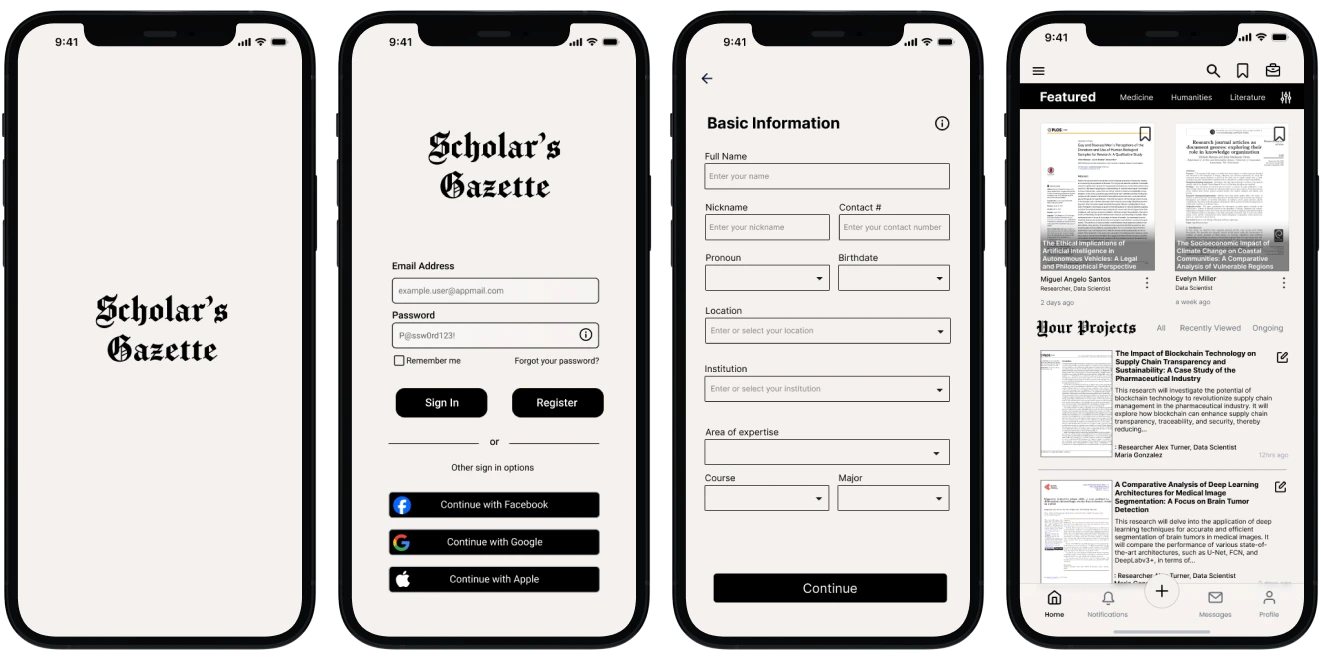
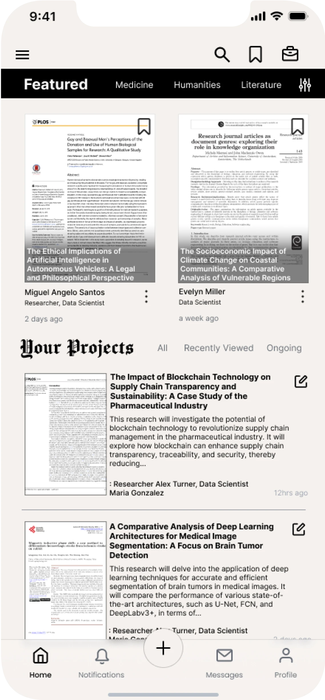
The platform’s name was then refined from “Par” to “Scholar’s Gazette” to more clearly communicate its purpose and target audience. This new name evokes a sense of academic credibility and information dissemination.
In terms of visual design, I drew inspiration from an established news outlets like The New York Times, opting for a classic black and off-white color palette to project a professional and authoritative image.

To enhance the app's intuitiveness and user experience, several key design changes were implemented. The bottom navigation bar was redesigned to include a prominent "Post a Project" action, providing researchers with direct access to this core function and freeing up space for showcasing featured projects.
Within the project view screen, a direct contact feature was added to facilitate communication between interested participants and project managers. To further enhance trust and transparency, a researcher verification feature was implemented, allowing users to view linked LinkedIn profiles.

Overall, the final design process and decisions was guided by the principles of modern and intuitive design, developed to provide a streamlined and user-friendly experience.
Overall, the final design process and decisions was guided by the principles of modern and intuitive design, developed to provide a streamlined and user-friendly experience.
PROJECT TAKEAWAYS
PROJECT TAKEAWAYS
During my time in uni and high school years, I identified the significant challenges of students face in recruiting research participants. Recognizing the potential to alleviate this burden and significantly improve the the research process for students, I was driven to design this platform.
During my time in uni and high school years, I identified the significant challenges of students face in recruiting research participants. Recognizing the potential to alleviate this burden and significantly improve the the research process for students, I was driven to design this platform.
"Build it, and they will come." - Field of Dreams
"Build it, and they will come." - Field of Dreams
Creating something that’s close to my heart: Recognizing the persistent challenges surrounding research participant recruitment, I was motivated to design a solution that would not only benefit other researchers but also directly address my own needs in conducting research.
Creating something that’s close to my heart: Recognizing the persistent challenges surrounding research participant recruitment, I was motivated to design a solution that would not only benefit other researchers but also directly address my own needs in conducting research.
Some wheels are not meant to be broken: I understood that by embracing modernity and intuitiveness does not necessarily mean I’m keeping myself in a box. Standards have been set for good and beneficial reasons.
Some wheels are not meant to be broken: I understood that by embracing modernity and intuitiveness does not necessarily mean I’m keeping myself in a box. Standards have been set for good and beneficial reasons.
"There's no 'I' in team.": I understood that by gathering data from other people not only gives me a broader perspective of a problem, but they can also have invaluable insights and ideas on what success for the platform may look like.
"There's no 'I' in team.": I understood that by gathering data from other people not only gives me a broader perspective of a problem, but they can also have invaluable insights and ideas on what success for the platform may look like.